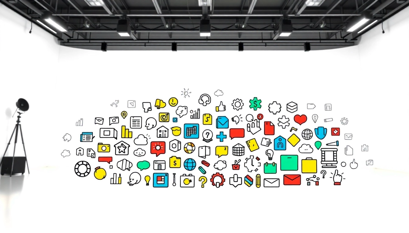
Understanding the Role of Icons in Design
Icons have become a vital element across diverse domains of design, from web interfaces to mobile applications and print media. These simplified pictorial representations serve as powerful visual communicators, guiding users seamlessly through digital and physical interfaces. Icons enhance accessibility and improve navigation, making them a critical part of modern design practices. With the increasing prevalence of visually driven media, understanding the role of icons is essential for designers and developers alike.
The Importance of Icons in User Interfaces
Icons significantly contribute to the user experience by representing functional concepts, actions, or information visually. They can condense complex ideas into intuitive symbols, reducing cognitive load and speeding up the user decision-making process. For example, a trash bin icon universally signifies a delete action, which can be easily recognized by users without a lengthy explanation. In interfaces, icons improve clarity and efficiency, making them indispensable for both branding and functionality.
History and Evolution of Iconography
The use of symbols to communicate dates back thousands of years, with ancient civilizations employing pictograms in writing. Iconography has evolved significantly, especially with the advent of digital technology. In the 1980s, graphical user interfaces (GUIs) introduced the use of icons in computing. Today, icons are integral parts of user interface design, continuously adapting to cultural changes and technological advancements. This evolution signifies how icons reflect societal trends, visual language shifts, and user preferences over time.
Common Misconceptions About Icons
Despite their critical role, several misconceptions about icons persist. One common myth is that all icons need to be universally recognizable. While this ideal is commendable, it overlooks cultural variations and context-specific meanings. For example, a floppy disk icon represents ‘save’ in many Western cultures, but its relevance is diminishing among younger generations unfamiliar with older technology. Icons should be designed with an understanding of the target audience and context to ensure effective communication.
Types of Icons and Their Uses
Standard Icon Types and Their Functions
Icons can be categorized into several types based on their functionality and context. Understanding these categories helps designers select and implement icons effectively.
- Action Icons: Represent actions, such as the play button for media or edit icons for content management.
- Navigation Icons: Assist users in navigating interfaces, like home, back, or search icons.
- Social Media Icons: Link to social platforms, represented uniquely for brand recognition, such as the Facebook or Twitter icons.
- Informational Icons: Provide information, such as warning signs or information, aiding users in understanding content context.
Animated vs Static Icons: Pros and Cons
Icons can be static or animated, each with advantages and disadvantages. Animated icons can attract attention and guide user actions, enhancing interactivity. For example, a loading spinner visually assures users that progress is occurring. However, overuse of animation can be distracting or annoying, leading to a poor user experience. Conversely, static icons are generally faster to load and less distracting, making them suitable for minimalistic designs where the focus is on content rather than flamboyance.
Icons in Various Design Systems
Icons serve various purposes depending on the design system in use. Established frameworks like Material Design emphasize the strategic use of icons to create cohesive user experiences. Icons should align with the overall aesthetic of the design system while maintaining clear communication and functionality. For example, when implementing a design system such as Bootstrap or Apple’s Human Interface Guidelines, maintaining consistency in icon style, size, and color is vital for a coherent look and feel across all interfaces.
Creating Effective Icons
Key Principles of Icon Design
Effective icon design relies on specific principles that ensure clarity and usability. These include:
- Clarity: Icons should be simple, using recognizable shapes and avoiding excessive details that can confuse users.
- Consistency: Maintaining a consistent style across icons, including color, line weight, and dimensions, fosters familiarity and usability.
- Scalability: Icons must be easily scalable without loss of detail to ensure usability across different resolutions.
- Contextual Relevance: Icons should be developed with consideration of the specific context in which they will be used, ensuring they fulfill user expectations.
Tools and Software for Designing Icons
Modern icon design is facilitated through a plethora of software options suited for different skill levels and complexity requirements. Popular tools include:
- Adobe Illustrator: Offers extensive vector design capabilities ideal for creating detailed icons.
- Sketch: A favorite among UI/UX designers for its intuitive interface and robust libraries for icon design.
- Figma: A collaborative design tool that enables real-time teamwork, vital for iterative design processes in icon creation.
- Affinity Designer: An alternative to Adobe, it also offers powerful vector editing features tailored for iconography.
Best Practices for Icon Customization
When customizing icons, implementing best practices ensures that they align with brand identity and project requirements. Key actions include:
- Adapting icons to fit color schemes, branding guidelines, and imagery to create a cohesive look.
- Testing icon visibility against various backgrounds, ensuring adaptability in different contexts without losing recognition.
- Gathering feedback from users during the design process to refine and enhance icon effectiveness based on real-world use.
Implementation of Icons in Projects
Integrating Icons into Web and Mobile Interfaces
The integration of icons into web and mobile interfaces demands a strategic approach to enhance user interaction. Essential considerations include:
- Placement: Icons should be positioned where users intuitively look to complete actions, such as near related text or functionality.
- Size and Spacing: Proper sizing ensures visibility without overpowering other interface elements. Adequate spacing avoids misclicks and improves user experience.
- Accessibility: Ensure that icons are accessible to all users, including those with disabilities. This may involve providing alternative text for screen readers.
Using Icons for Branding and Marketing
Icons play a pivotal role in branding and marketing strategies, serving as visual touchpoints that reinforce brand identity. Consider these tactics:
- Custom Icon Sets: Developing recognizable, proprietary icon sets can significantly enhance brand recognition.
- Social Media Integration: Icons help populate and guide users to engage with social media platforms linked to the brand, amplifying marketing campaigns.
- Merchandising: Well-designed icons can translate easily into various brand merchandise, enhancing visibility in both online and offline formats.
Case Studies: Successful Icon Usage Examples
Looking at successful applications of icons offers valuable lessons for design. For instance, Apple’s human interface design integrates icons seamlessly across its applications, maintaining consistency that fosters intuitive user experience. In contrast, Google emphasizes clarity and function, using simple icons that communicate their purpose efficiently. A comparative analysis of these contrasting styles reveals potential strategies to enhance usability and visual appeal in user interfaces.
Future Trends in Icon Design
The Impact of Technology on Icon Development
The evolution of technology continues to shape icon design. Emerging technologies such as augmented reality (AR) and virtual reality (VR) are influencing how icons are perceived and interacted with. In these environments, icons may shift from 2D symbols to spatial representations, challenging designers to create intuitive icons that work in three dimensions. Additionally, advancements in AI will likely impact icon generation processes, allowing for the automatic creation of adaptive icon systems tailored to user preferences and behavior.
Emerging Styles and Techniques in Iconography
As design trends progress, new styles and techniques emerge in iconography. Some current trends include:
- Flat Design: Focuses on minimalist aesthetics where icons adopt a two-dimensional approach, emphasizing simplicity and usability.
- Glyph Icons: Simplified line art is often favored for its elegance and clarity, aiding quick recognition.
- Custom Illustrative Icons: Offers a more personalized touch that can reflect brand personality and engage users on a deeper level.
How to Stay Current with Icon Design Trends
Keeping abreast of trends in icon design is essential for staying competitive. Designers can use a combination of strategies:
- Regularly exploring design-focused platforms like Behance or Dribbble to observe contemporary designs and innovative concepts.
- Participating in design communities and forums such as Designer Hangout to engage with peers and exchange insights on evolving practices.
- Following design thought leaders and trend forecasters on social media platforms to receive updates on the latest industry shifts.